
Wondershop
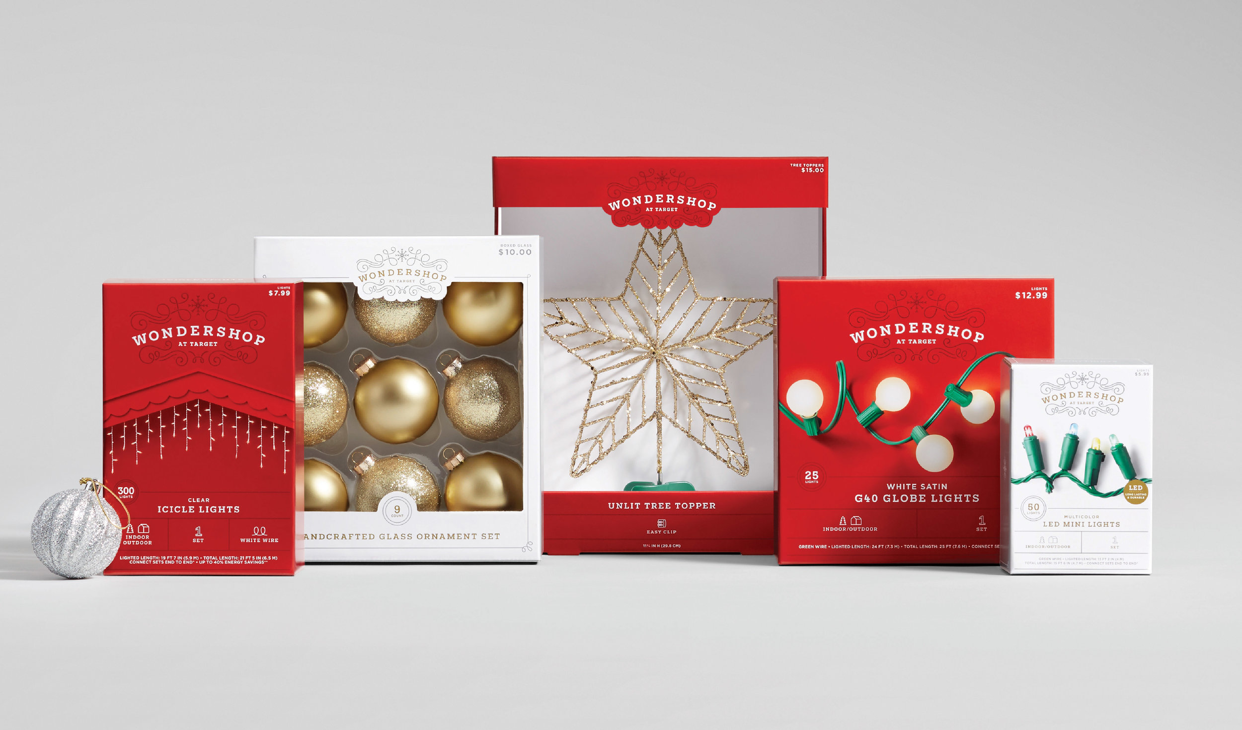
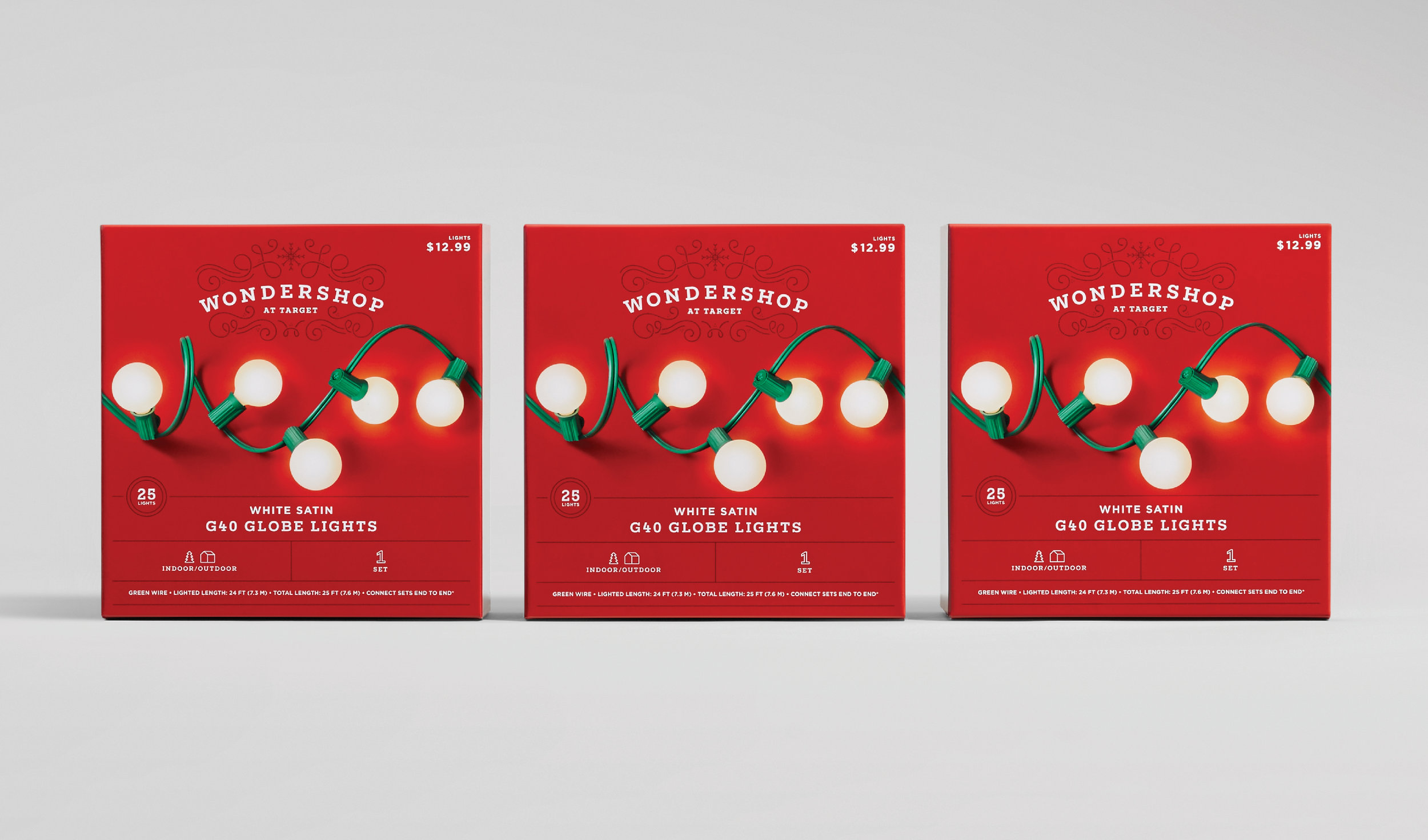
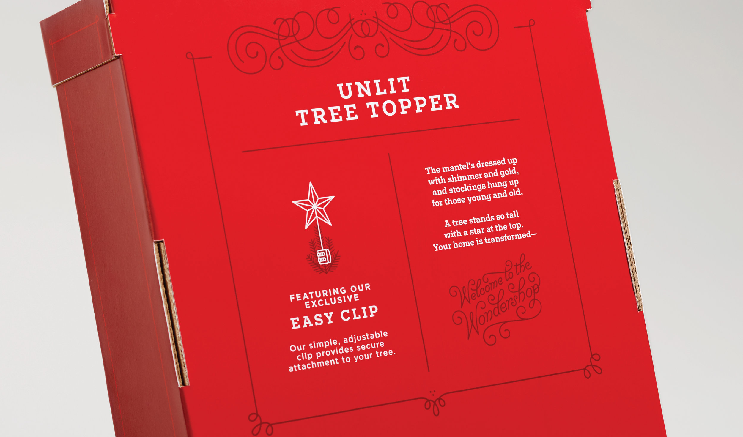
Wondershop is Target's owned brand that celebrates all things holiday. Over the years it has evolved into an all-encompassing holiday experience for our guests, playing in nearly every category of the store. The packaging comes in two colors: red packaging for more basic items, and white is for our more trendy products that need more of a frame to elevate the product. Across the assortment, there are special details such as unique snowflakes and flourishes on the back and sides of packages and a product-specific poem on the back that tells the brand’s story.
My Role: Lead designer, art director, illustrator
Credits
SCD: David Hartman
ACD: Steve Jockisch
PD: Nichole Bennett, Angela Leidall
AD: Amy Miller
Copywriter: Anna Zahler
Illustrators: Laura Bee, Kelly Thorn